How to Choose the Right Logo for Your Brand
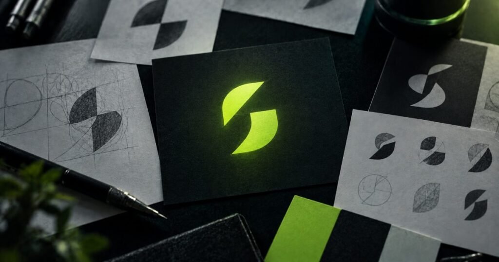
A logo is the first visual element people encounter when they come across your brand, and it typically forms an impression within seconds. That impression can shape everything from how trustworthy and professional your brand feels to how your prices are perceived. In this article, we walk through every step you should consider when choosing — or commissioning — the right logo, with practical examples along the way.
What a logo is, and what it isn’t
A logo isn’t your entire brand — it’s just one part of your visual identity. Together with your color palette, typography, photography or illustration style, and tone of voice, it forms a complete system. That’s why expecting “a great logo to solve everything” isn’t realistic; a logo is the gateway element of a much larger identity system.
Types of logos: which one fits your brand?
There are a few core categories of logo design, each suited to different needs:
- Wordmarks: The brand name written in distinctive custom typography. Companies like Google and Coca-Cola use this approach. It works best when the brand name is short and memorable.
- Lettermarks: Built from the brand’s initials (think IBM or HBO). A practical solution for longer business names.
- Symbols/icons: An abstract or figurative mark, like Apple’s apple. Usually paired with the brand name until the symbol becomes recognizable on its own.
- Combination marks: A symbol and wordmark used together — the most flexible and widely chosen type. Often the safest choice for new brands, since the symbol and the text can also be used independently.
- Emblems: Text set inside a shape or badge, a classic approach commonly seen in corporate, education, or automotive branding.
Simplicity always wins
The most memorable logos tend to be the simplest ones. Intricate details get lost on small screens — favicons, social media profile photos, business cards. A good logo should read clearly whether it’s printed in black and white, shrunk to a 32×32 pixel favicon, or blown up on a large sign. During the design process, ask yourself: could this logo still work if it had to fit on a matchbox?
Color choice: psychology and distinctiveness
Color has a direct impact on how your brand is perceived. Blue tones tend to signal trust and professionalism, green suggests nature and sustainability, and red conveys energy and urgency. But psychology shouldn’t be your only criterion — you should also look at which colors your competitors are using. Choosing a different color in a sector where everyone uses blue can make your brand instantly more distinctive.
At Creavizio, we generally recommend working with one or two primary colors and at most one accent color. Multi-colored logos raise costs across different applications — printing, embroidery, embossing — and make consistency harder to maintain.
Typography: a quiet but powerful message
Typeface choice sets the “tone of voice” for your logo. Sharp, geometric fonts create a modern, tech-forward impression, while rounded fonts feel warmer and more approachable. Serif fonts emphasize tradition and trust, while sans-serif fonts offer a more contemporary look. Clearly defining how you want your brand to be perceived is the first step toward choosing the right typography.
It should reflect your brand’s voice
Before starting logo design, ask yourself: how does my brand want to be perceived? Serious and corporate, or energetic and innovative? Your color palette, typography, and shape language should reinforce that identity, not work against it. To get clarity here, we usually look for answers to three questions: what values does your brand represent, who is your target audience, and how are your competitors positioned visually?
It should stand the test of time
A trendy design style can look dated within just a few years. Take the “flat design plus gradient” trend that was popular in the mid-2010s — it now looks distinctly of its era. Building your logo around your brand’s long-term values, rather than passing trends, saves you from unnecessary redesign costs down the line. A well-designed logo can remain unchanged for 10-15 years, or even longer, needing only small “refresh” touch-ups to stay current.
Test it across different use cases
A logo doesn’t just live on your website — it shows up on packaging, signage, social media posts, invoices, vehicle wraps, and countless other places. Before finalizing your design, always test your logo in scenarios like these:
- Single-color (black and white) printing
- Very small sizes (favicon, social media profile photo)
- Dark and light backgrounds
- On a physical product (label, packaging, business card)
At Creavizio, we test every logo design across all of these scenarios before delivery.
Common mistakes
Some of the most common mistakes we see in the logo design process: choosing overly detailed, complex designs; making decisions based purely on personal taste while ignoring the target audience; using stock images or icons that carry copyright risk; and delivering a logo without a usage guide (brand book). Logos delivered without guidelines tend to be used inconsistently by different people over time, which weakens the brand’s overall perception.
When should you consider a rebrand?
If your logo still functions well and aligns with your brand strategy, there’s no need to change it just because it’s trendy to do so. But a refresh is worth considering if your business has significantly changed its target audience or service offering, if your current logo doesn’t work well in digital contexts (app icons, social media), or if your brand no longer reflects the values the old logo represented.
Conclusion
The right logo isn’t a standalone piece of art — it’s a functional tool that translates your brand’s strategy into a visual language. A process built on simplicity, consistency, and a genuine reflection of your brand’s identity produces a strong result you can use, unchanged, for years to come.
If you need a logo and corporate identity built from the ground up for your brand, tell us about your project — let’s build your visual language together.
Want more on “how to choose the right logo”? Take a look at our related Creavizio solutions.